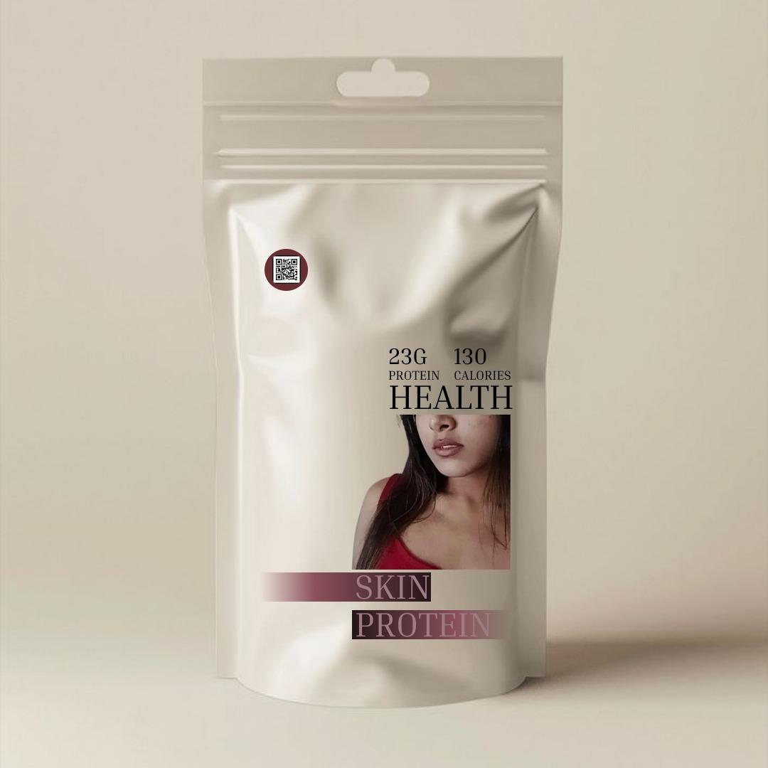
Health Brand Packaging
Minimal Luxe Wellness
⸻
🌟 Concept Keywords:
• Clean Beauty
• Holistic Health
• Modern Femininity
• Skin + Nutrition Synergy
⸻
🎨 Visual Style:
• Monotone beige background gives a neutral, premium, and calming vibe, perfect for wellness products.
• Soft gradients and muted pinks/mauves reflect subtle femininity and sophistication.
• Sans-serif typography combined with bold, elegant type for words like “HEALTH” or “PROTEIN” signals trust and clarity.
• The cropped, aesthetic photo of a woman in a red top adds a human connection and subtly emphasizes beauty and skin care.
⸻
📦 Tone & Feel:
• Luxurious but accessible — no clutter, no overwhelming design.
• Appeals to health-conscious individuals who are drawn to beauty, skincare, and fitness.
• Packaging looks clean, shelf-ready, and targets both the modern woman and the premium wellness niche.
⸻
🧬 Intended Audience:
• Young to mid-age adults, especially women.
• Individuals focused on inner and outer wellness — those who buy protein not just for muscle but also for skin, hair, and overall glow.
Client
behance
Service Provided
product design

The Goal:
To convey a sense of premium, health-focused nourishment tailored specifically for skin wellness, while appealing to modern consumers through minimalist aesthetics and clean design.
1
The Challenge:
To design a minimalist, premium-looking packaging for a skin-focused protein supplement that blends wellness with beauty, appealing to health-conscious users who care about skincare from within.
2
The Result
The final packaging uses a neutral, elegant theme, emphasizes key nutritional info, and visually connects with the skincare market — making it both informative and visually attractive on the shelf.
3